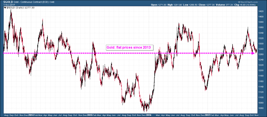
As President Trump prepares to nominate a new chair for the Federal Reserve this week, gold prices remain in a range bound consolidation. Not only has this grinding pattern been ongoing for the last several weeks, but when we examine the price chart for the last five years, we see that gold has essentially been flat as a net sum dating back to mid-2013. And indeed, to the mainstream investor who is primarily involved in a stock market now at all-time highs, gold appears of little interest at the present moment:
Yet we believe this is exactly the time when contrarian-minded individuals should be starting to pay attention to the precious metals. For underneath the surface, despite flat prices since 2013, gold is showing hints of strength to come.
In fact, there is a major leading indicator that is now flashing a buy signal. This signal has only registered once before in the past 17 years. And in the markets, the key is to act before something is widely recognized by the mainstream. Let us turn to this leading signal.
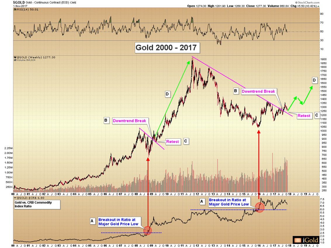
For the following discussion, we will refer to the chart below and the annotations (A) through (D):
Gold Vs. Commodities Signal
The leading signal follows a series of three points, and the only other time that this signal has ever registered occurred at the major low for gold prices at $680 per ounce in October 2008, during the depths of the credit crisis (red arrow).
First, point (A), shown below the main chart: note how in October 2008, gold broke out versus the CRB commodity index at the major low. What this signal demonstrates is that even as gold prices were falling in the crash, they were falling at a much lesser rate than the rest of the commodity sector. Internally, this shows relative strength in favor of gold. In layman’s terms, it means that some investors were accumulating gold even as the rest of the commodities were being sold, and this signal hints that gold will lead once the rest of the commodity sector bottoms.
Next, point (B): in February 2009, gold broke through its declining (magenta color) trendline at $900 per ounce. This trend of lower prices began at the 2008 peak at $1,033 per ounce. Gold then rallied back to $1,000 within three weeks.
Next, at point (C): gold fell in April 2009 back down to $860. This decline resulted in a retest of the now-broken trendline, so labeled on the chart. A retest occurs as investors who bought during the initial price break are tested to see if they will show up again near the same level. Note that a retest of a broken trendlines can indeed occur at a lower price ($860) than the initial breakout point ($900). The most important facet is to recognize that the trend of lower peaks has broken.
Point (D): a multi-year rally to new highs commenced.
In sum, the leading signals (A) – (C) of gold rising versus the broad commodity index at a major price low, the downtrend break, and the trendline retest were all sequential indicators of a significant advance in prices setting up for the future. But those who waited for gold to advance well north of $1,000 per ounce had few opportunities for pullbacks over the next two years as prices more than tripled from 2008 crash lows.
Same Signals Registering Today
The same set of signals are now registering for gold again, only on a greater timescale and with potentially greater ramifications.
Note how (A) gold again broke out versus the CRB commodity index at a major price low ($1,045), in December 2015. This indicated gold accumulation was ongoing, even as most commodities were being discarded. This was the only other time that this signal has registered outside of the crash of 2008.
Next, at (B) gold broke its long-term 2011 – 2017 downtrend, at $1,265 in August 2017. Again, we see the pattern of lower peaks since 2011 being broken, the same signal which occurred in February 2009.
Presently, gold is (C) retesting that long-term downtrend break. Once again, in the same scenario as the initial example, this retest is occurring at a slightly lower price than the original downtrend break, as gold has recently fallen to $1,262 within the last two weeks. This is entirely acceptable within the technical model. The key is that the broken trendline should not fail, even if the retest occurs at a lower level.
After this retest occurs, our model indicates that a major rally will unfold. This will represent point (D) on the chart above. Our initial target for gold remains $1,485 – $1,535, but this is a first target only. It is quite possible that gold will advance well beyond that level in the years to come to perhaps challenge or exceed 2011 highs, but for the time present we are focused on initial targets only.
Imagine having sold gold at $860 in April 2009 out of frustration, on the retest of the broken trendline. This would have marked the last time gold ever traded below $900 before the major 2009 – 2011 advance carried prices higher by over $1,000 per ounce.
That same technical retest is occurring now in the gold market – it is just happening on a much longer timescale and at a higher initial price point.
We continue to believe that the present period will represent the final opportunity for those investors who are only focused on the nearly-flat prices since 2013 (as indicated on the first chart) to get washed out of this market in frustration.
Takeaway On Gold’s Leading Indicators
Subtle strength is building underneath the gold market. A leading signal only seen one other time – the 2008 low at $680 per ounce – has again registered. The downtrend break has occurred. Gold is now retesting that downward trend.
This retest process could take several more months to play out, but the leading signals hinting for a major rally setting up in 2018 and beyond should not be overlooked.
Link to original article: http://news.gold-eagle.com/article/gold-price-forecast-%E2%80%93-first-breakout-signal-2008/816


